Friday, May 20, 2016

Project Notes: Salina Dress

It seems like every other post is me apologizing for not having blogged in forever. And while I do enjoy writing and interacting with all of you (you're seriously the best followers anyone could ask for, and your support means the world to me), it's been really good to take a break from this space, because three years after I started this blog, I think I've finally discovered what I want this space to be.

I started this blog to share my love of crafting, with the goal of eventually having the readership and influence of sites like Doll Diaries. Over that time, as my focus and writing have changed, it's always been about what will attract a certain readership base, what will help me reach Internet fame/a job/etc. And while fame isn't necessarily a bad thing, I felt like I had to present myself and shape my posts a certain way to create this Internet presence or persona that would be desirable. And while it was fun for a while, I've grown and changed a lot as a person, and it doesn't feel authentic anymore.

This January, I finally started using Instagram (paper.doll.world), and decided that I was going to focus on posting a picture every day instead of thinking about how many likes it got or the number of followers I had. That mentality has made me a lot happier, and I want to apply it here. So no more thinking about "how would X write this post?" or "how will X post affect my branding?" but "what makes me happy?" I think this blog will be better for it.

All right, now for the real reason you're here: this dress! I had the urge to try out this pattern a while back, and thought that this gray and white remnant in my fabric box would be perfect.


Fabric: a silky white knit for the lining, and a sheer gray and white geometric pattern knit. They draped well, and if I had more of the gray fabric I would probably use it again with this pattern. The only problem that I had with it was that since the fabric was so thin, it was difficult to tear out stitches without creating holes in the fabric in the process.


This pattern is described as easy, and that's a pretty fair assessment. The one area where I ran into a bit of trouble was the bodice, and I think that was because my machine was not happy about trying to sew two to four layers of stretchy knit. Next time I think I'll cut the bodice all as one piece to avoid this issue.


I wasn't quite sure how long I wanted the skirt to be, so I just cut it as long as the fabric would allow, and then adjusted from there. This is what it looked like pre-adjustment - not exactly the look I was going for, although now I'm tempted to try a maxi dress in the future.


After I decided on a length, I hemmed both pieces of fabric and attached them to the bodice. I cut them after I made the casing for the elastic, which might seem a little silly but worked quite well.

The best part of the dress for me is the inside. 

That back seam is actually straight, it just looks wonky in the photo
All the raw edges are either enclosed or finished, and the armholes and neckline are topstitched. The stripes match in the back. In terms of getting the technical details right, this is probably the best thing I've ever made, and I'm very proud of it.


And the best part: both the dress and Isabelle will be up for sale soon! I'll share more details once I have time to set that up, but let me know if you're interested in either Isabelle or the dress. 
EDIT: dress and doll have found a new home, but hopefully more doll clothes will be for sale soon

Any suggestions for what to sew next?

Wednesday, November 25, 2015

Project Notes: Woomera Dress

Thanks all for your encouragement! You're the best. I'm still trying to get things settled with my vision of what I want this space to be, so until then, here are some pictures of a project I made back in August. I thought it would be a fun way to share my latest projects and related tips/rants/lessons learned.

First project: The Woomera dress by Liberty Jane Clothing


Fabric: a yellow bird-print chiffon. I really wish I'd bought more of it, it's really cute (although chiffon is a major pain to sew). The chiffon is silky and the colors look great, though it doesn't iron very well.

This pattern was a real challenge; the label says "intermediate" but it felt more like "advanced." I'm really bad about making mock-ups before breaking out the good fabric, but I cannot emphasize enough how important it is to do that. See where I attached the back left yoke backwards? This is something that you should figure out with your cheap practice fabric, not with the good stuff. (Especially since chiffon frays like crazy, so it's good to minimize the number of seams you have to tear out and redo.)


Also, did you see the bottle of Fray Check in the photo above? I used to swear by it, especially when sewing with chiffon, but after getting through this project I'm going to minimize how much I use it. For those who aren't familiar with Fray Check, it's a fluid that effectively "glues" raw fabric edges so they don't fray. This sounds great, especially since not everyone has a serger to finish raw edges, but it leaves behind an awful crunchy residue. It's also impossible to remove, which is great when you finally get the bodice to look right and then spill Fray Check all over it and have to start over. Moral of the story: don't use Fray Check or similar products. 


Sewing over the edges of chiffon pattern pieces with a tiny zigzag stitch is a much better way to keep pattern pieces from fraying, and is the method I'll be using from now on (as you can see in the photo above). 

Speaking of zigzag stitches, the pattern calls for a zigzag stitch to keep the gathers at the shoulders in place. For some reason, that never worked out for me - maybe the zigzag stitches on my machine are too big? Running a straight stitch over the gathers worked, though. 


Some notes about the pattern that I would change the next time I make this: the opening in the back of the skirt doesn't need to be that big, so feel free to sew up the back of the skirt higher than the instructions say. Also, while French seams are a major pain, they're really good for sewing fabrics that are prone to fraying. I'll also make the skirt longer - while it looks cute as is, the extra length would give it some more drama, especially with the uneven hemline.

My biggest tip, though, is to match up sleeve seams with side seams. Few things are more annoying than the seam closing the sleeve not lining up with the seam in the side of the garment. You can avoid this whole issue by sewing both the sleeve and the side as one seam, which is my personal favorite technique. Here's a good explanation with photos.


And here's Sabriel Madeleine (can't decide which name she'll go by) looking adorable in her new dress. I don't have any fold-over elastic, so I haven't made the slip that goes with this dress, so a white sleeveless top will have to do. I'll also take some better photos when the lighting isn't so gray and abysmal.

I hope you enjoyed this episode of Pattern Notes. Any suggestions for future posts?

Sunday, November 8, 2015

Should I Continue?

It was brought to my attention that I've only written three posts this entire year. That's only one more than I made when I first started this site, back in 2012, and then I had the excuse of starting the blog in December. And yes, I can give all the standard excuses of work, a big move, general life stress, etc., but while these are all true, they're getting old. I want to do better, and you loyal readers who have stayed and haven't unfollowed even despite my silence here (particularly one wonderful reader who emailed me the other day - I don't have permission to reveal their identity, but you know who you are) deserve better. 

Honestly, while all the above issues are valid, my biggest blogging roadblock is my changing interest.  I'm having trouble figuring out what I want this blog to be; it started as a place to share papercrafting tutorials, but I think that it's outgrown it in some respects - not at all that papercrafting is in any way childish or immature, but there's really only so much to make tutorials for, and to be honest there's only so many times and ways I can say, "draw this shape, cut it out, fold and tape it" before everyone gets bored. And I have other interests that I'd rather pursue and share with you too, but would you even read about them? I think that's the root of my lack of blogging: I want to write about other things too, but I don't know if you would want to read them since you come here to read specifically about paper dolls. I could start another blog, but I don't want to lose the wonderful community of readers that have stuck around for almost three years (can you believe it's been that long?). And what's the point of blogging if it doesn't make you happy any more, just because you committed to a URL? (To be clear, I still very much like papercrafting, but I'm starting to feel boxed in.)

So, question for you: would you continue to read this blog if it wasn't a straight paper doll site anymore? I want to give you content that you enjoy, and above all I don't want to bore either you or myself.


Here's a photo to help combat the angst you just read.

Sunday, April 19, 2015

A Series of Stressful Events (+ Giveaway!)

Wow, it's been over a month since I was gone. My apologies for my absence - four weeks of crazy deadlines and difficult personal issues tend to eat up blogging time. But today's post isn't a series of complaints - it's a story of perseverance against the odds (read: my doing things that I really had no time for, and suffering the consequences) in which your help was indispensable.

To make it short, I'm going to present it as a timeline:

August: While I was on vacation with my family, the Doll Wardrobe released the theme for the Winter Fashion Design Challenge, and it looked like a lot of fun. I'm a fan of Fluttershy from My Little Pony, so I thought that her Equestria Girls outfit would be the perfect thing to make. Until I saw it, that is.

By litingphires on DeviantArt

Sorry, but that's just too boring. As I'm also a huge fan of the Lizze Bennet Diaries, I realized that Jane Bennet and Fluttershy have very similar personalities, so I decided to make the sort of outfit that Jane would wear, but in Fluttershy's signature color scheme and motifs.

September - November: I started sewing the outfit as fast as I could. In contrast to the summer, when I had plenty of free time to sew, all my time was eaten by my courseload. I put everything together as fast as possible, and took photos during my trip home (it rained, so technically I took them an hour before I had to leave). When I got back from my trip, I realized that I'd left the charging cable for my laptop, so I had to run around for twenty minutes at midnight trying to find someone to lend me a cable. Since it was dark, I missed a curb and fell, which meant that I needed to be in an air cast boot for two weeks. The things I do for love sewing contests (yes, that was a Song of Ice and Fire reference, and kudos to any of you who caught it). 


February - March: Voting opened, and I checked it daily. It was very close for most of the time, but at the end my entry came in third out of four in the votes. It was a disappointment, but I resigned myself to it, was very grateful to all of you who voted for me, and put it out of my mind.

April: I got an email from The Doll Wardrobe with the subject line Winter FDC Entry. At first, I thought it was a joke or a mistake, but then I saw this post. There was dancing, a little bit of shrieking and crying, and plenty of celebratory chocolate was consumed. I haven't been so happy in months, and it would never have happened without your support. 

So, per the traditional agreement, I'm going to pay it forward with a giveaway! Details are still uncertain, so comment with what you think would make a nice prize (within reason - as much as I would like to give you extravagant prizes, that's just not in my budget) and hopefully before long I'll have the giveaway up and running. 

Once again, thank you for reading and for your support!

Sunday, March 15, 2015

Guest Post by Minty: Grace's Bakery Cart

Way back in January, Vera from Valerie and Vera kindly wrote up a guest tutorial for the food from Grace's bakery cart. Unfortunately, due to an insane work schedule I haven't gotten around to posting it until now. Thank you Minty for sending this tutorial and for being so gracious about my delay!
-----

Hello everybody! Today I will show you how to make the food from the new Girl of the Year Grace's bakery cart. Here's the stock photo:


Let's get started! First, use your doll for scale and draw a long, curved oval.


Add three curved lines from the top side to the approximate middle.


Draw another curved line connecting the end of your previous line to the top line.


Repeat the previous three steps for another baguette.


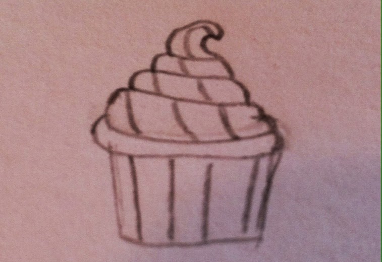
Next, let's make the cupcakes! Start by drawing a short, straight line with two other lines extending off of it.


Now draw a sideways "C" on top.


For lack of better terminology, draw a cupcake frosting shape on top of that. ;)


Add detailing lines on the frosting and the wrapper.


Repeat the previous steps for a second cupcake.
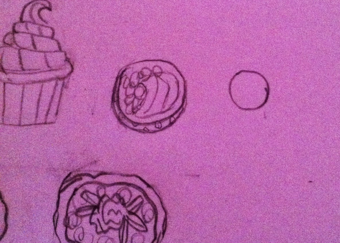
Now for the tarts! Start with a 'wiggly circle' shape.


Draw a similar shape inside the one you just drew.


Next, draw a cluster of strawberries in the center.


Finally, add detailing, such as dots on the strawberries and swirls in the frosting.


Repeat the first two steps for the tart for a second one. Then, draw a small rose surrounded by leaves.


One more tart to go! Start by drawing a small circle. Add a curved line on the side for a 3-D effect.


Finally, draw a garnish on the top.


You're done with the tarts! Now for the macaroons. Begin with drawing a tiny circle.


Draw a wavy line all around the circle you just drew.


Repeat for as many macaroons as you want. I made three.
On to the cake! Start by drawing a large cylinder shape.


Draw in detail lines on the bottom, and make a criss-cross pattern on the remainder.


Draw a curved line from top corner to top corner, and add a bow on top. Finish by drawing a rectangular slice of cake. (Sorry, I got lazy)


Now outline in Sharpie pen...


...color it in...


...cut out a rough outline...


...tape laminate...


...cut out...


...and you're done!


Thank you so much, Vera, for writing this tutorial and for your patience with me! I hope you enjoy trying this tutorial for yourselves.

Thursday, January 1, 2015

Grace In Stores

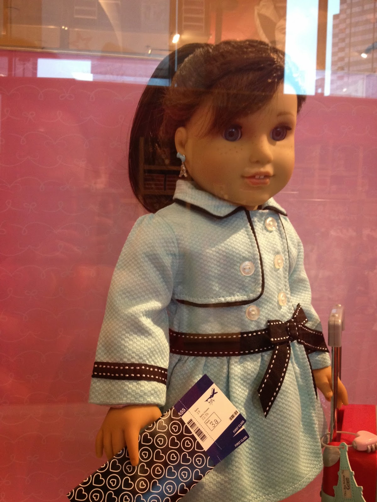
Happy 2015! Like last year, I stopped by the American Girl Place to check out Grace Thomas, and took some photos for any of you who want to draw her items for your paper dolls.  It was crowded and crazy, but a lot less so than last year. I really don't know what's up with the terrible lighting in the American Girl Place, but I hope that these images are helpful.


Grace herself was a lot prettier in person than in her stock photos. Her hair is darker than the photos led me to believe, and she has lighter brown highlights that make the hair look more natural.  She's definitely got a new freckle pattern, and I believe but am not certain that she has Marie-Grace's eyes (that sounds a lot creepier than I intended, sorry). Her eyebrows are thicker than the normal feathered ones, which I also appreciate. 

Here she is in the box:


This picture shows more clearly the different shades of brown in her wig:


A closer look at her bracelet taped to the side of the box. It's definitely cute, but I'm not sure if I'm such a fan of this extra price-spiking accessory trend.


Grace's city outfit is stylish and seems to be well-made, but I wish I could say the same for the accessories (I was so unimpressed with the coin purse, metro ticket, and lipgloss that I neglected to photograph them). They're priced similarly to Isabelle's and contain practically the same items, except Isabelle's seem to be of better value for the cost because they included a jacket. The design team really dropped the ball here.


Despite the misleading stock photo, the cupcakes on her shirt are right-side up. I'm not the biggest fan of this set, but those shoes are pretty cute.


I don't love that the jacket is $28 on its own (at least include a pair of shoes so I don't feel entirely ripped off), but the material is nice and thick, and the buttons are functional, which is impressive. The earrings are meh, though - if you're going to charge extra for exclusive earrings, how about including more than two sets of studs and one set of dangles?


I'm not a fan, but it was a pretty popular item when I was at the store. If any of you attempt to recreate this in paper, I'd love to see it!

Some more of the food cart:


And, of course, the monolithic bakery:


You guys, this thing is massive. I have no idea where or how anyone would store such a thing, but it makes for great photo shoots. 


I can't wait to replicate this in paper!

The thing that made me laugh the most was this, though:


The level of combined sass and revulsion in Bonbon's expression almost makes it worth the price tag. I'd feel the same way if I'd been named after a piece of candy and then had a bow stitched to my ear - I feel your pain, little guy.

Like last year, I didn't buy anything, but seeing the products in person helped inspire me to create my own paper versions (that bakery is happening as soon as I can figure out how to put it together). What do you think of this new collection?
Related Posts Plugin for WordPress, Blogger...